Summarise a table
Use pandas to read a CSV, filter rows and group values. Turn an expense list into totals by category.
Data and Python on Mac
Read a CSV, compare measurements or plot a result. Work on the code and inspect its output from your Mac workspace. The image-classification example additionally needs the free Helper and a PyTorch download of several hundred megabytes.
Libraries for everyday Python work
Use pandas to read a CSV, filter rows and group values. Turn an expense list into totals by category.
Use NumPy for measurements, averages and formulas applied to a whole collection of numbers.
Use Matplotlib to compare categories or follow changes over time. Save a chart to share with your report.
Try a small example
Group expenses by category and add up the amounts. Then replace the sample with a CSV you want to understand.
This example uses pandas, included in the Mac app.
Create your first project →expenses.py
import pandas as pd

expenses = pd.DataFrame({
    "category": ["Food", "Travel", "Food"],
    "amount": [12, 8, 18],
})

totals = expenses.groupby("category")["amount"].sum()
print(totals.to_string())Explore a larger example
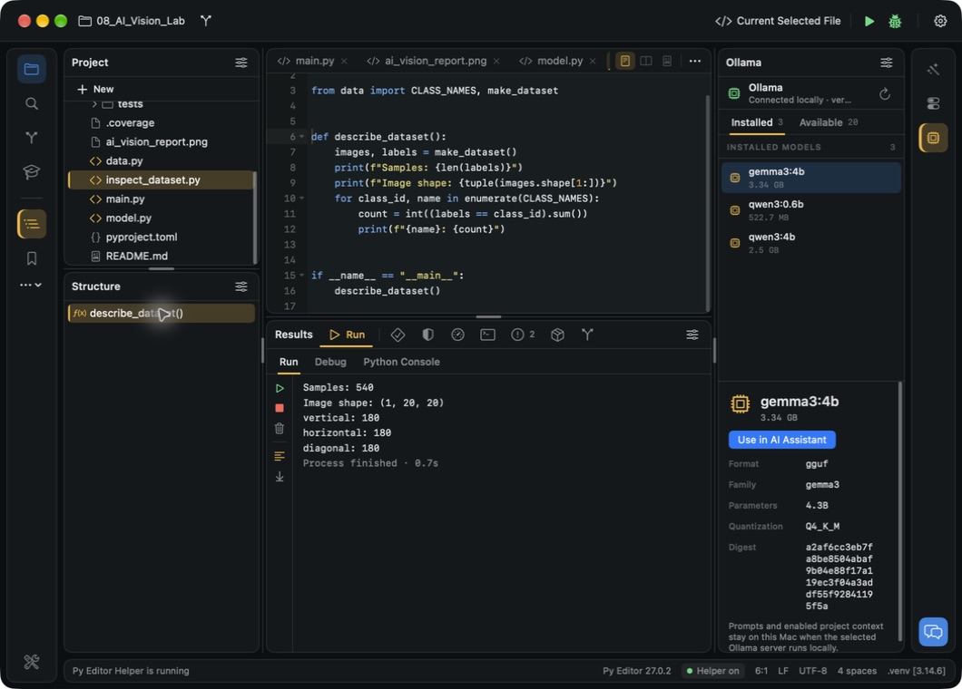
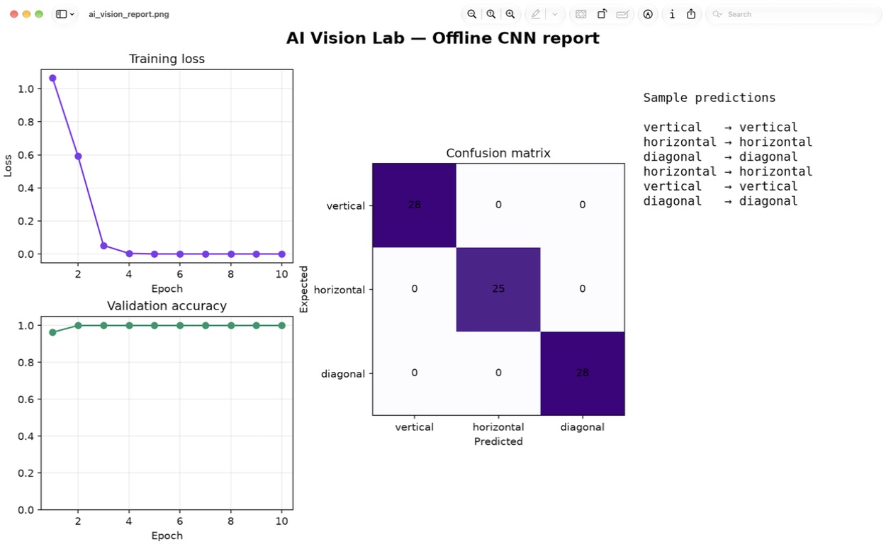
AI Vision Lab creates a small dataset of patterns, trains a model and generates a report. Inspect the training code, then compare the predictions with the expected labels.
Git, the Terminal, the Python Console, debugging, packages and the profiler need the free Helper, a separate download. Examples also need project dependencies. Follow the setup guide.
Bring more into your scripts
Use Pillow to resize an image, inspect its dimensions or create a processed copy.
Use Requests to fetch JSON and select the fields your analysis needs.
Use Beautiful Soup to find text and links in pages you have permission to access.
Download the Mac app with Python and useful libraries included.